Art and Art Deadlines.com

A food-themed FREE resource site for ARTISTS.

×
Art and Art Deadlines.com

Tag: Graphic Design

CALL for ENTRIES: Opulent Mobility

Click to Subscribethe lazy
GOURMET

I had another Jetsons dream.  This one involved me in my futuristic kitchen that was equipped with completely mobile gadgetry.  I could sit or stand in one place and everything would come to me as I needed it just by thinking it.  Is it telling that I even dream about my own laziness?  Maybe instead of my laziness, it was just a premonition of a design for this next Call.  So cool…

Check out this Call for Entries from Dreams by Machine (Ventura, CA) for Opulent Mobility.  I rarely get to describe a Call as unique and even more rarely get to publish that there is no entry fee; but, this Call is both.  Don’t miss this winning combination…

*Editor’s Note: If you have read the personal portion of this post, CALL for ENTRIES: Opulent Mobility, anywhere other than by email subscription or on ArtAndArtDeadlines.com, it has been published without permission and is considered theft.

Learn more about Let's Talk About Mobility from Dreams by MachineCALL for ENTRIES:
Opulent Mobility


If you could have a walker, a wheelchair, crutches, prosthetic arm/leg/etc. or a home/workplace with unlimited accessibility of any style and any kind, what would that look like?  What secret powers would they have?  How do you re*imagine mobility and disability?

Opulent Mobility is a juried gallery show devoted to re-imagining mobility and disability. It will be held at the Bell Arts Factory in Ventura, CA  from September 6-8, 2013, opening on their popular First Friday. The gallery is beautifully designed for wheelchair and walker accessibility.

Learn more about Let's Talk About Mobility from Dreams by MachineThey are looking for  2D art that helps start a conversation about what works and what doesn’t in mobility and disability devices, designs and everyday living.

ELIGIBILITY:  Open to all artists

MEDIA:  Drawings, paintings, digital works, photography, multi-media —anything that can be hung on a wall

DEADLINE:   August 19, 2013

NOTIFICATION:  August 21, 2013

ENTRY FEE:  None

SALES:  The gallery takes a 30% commission of sales.

For complete details, Read the Full Call!

Read the Full Call from Dreams by Machine!

CALL for ENTRIES: Fiery

Click to Subscribe to www.ArtAndArtDeadlines.com by Email!DAILY BREAD,
I mean yogurt

Can you imagine having the same food everyday?  I have a friend that eats plain Greek yogurt with honey at approximately 10:30 am every morning.  She makes her own yogurt, and I love Greek yogurt.  But EVERY DAY?  I read French Women Don’t Get Fat, but I still couldn’t eat it every day.  This next wants to see your artwork EVERY TIME.  Take a look…

Check out this Call for Entries from Firehouse Art Center (Longmont, CO) for the Firehouse Films Logo Competition!  Here’s a great graphic design competition that isn’t exclusively for graphic designers.  Cool opportunity…

*Editor’s Note: If you have read the personal portion of this post, CALL for ENTRIES: Fiery, anywhere other than by email subscription or on ArtAndArtDeadlines.com, it has been published without permission and is considered theft.

Learn more from the Firehouse Arts Center in Longmont CO!CALL for ENTRIES:
Fiery


ELIGIBILITY:  Open to all artists

MEDIA:  All unique and creative designs in any medium will be considered. Time-lapse or animated shorts are encouraged, as the logo will be shown on screen before each film. A still image of the final logo will be used on all promotional materials.

DEADLINE:  June 27, 2013

NOTIFICATION:  June 29, 2013

ENTRY FEE:  None

AWARDS:  The winner will receive $200 and 2 tickets to the Front Range Film Festival on June 28, 29 & 30. The winning logo will be announced and unveiled on Saturday, June 29.

For complete detail, Read the Full Call!

Learn more from the Firehouse Arts Center in Longmont, CO!

CALL for SUBMISSIONS: 4AV

Click to Subscribe to www.ArtAndArtDeadlines.com by Email!HOLD THE PLASTIC
please

I suspect you already know I’ve got a little touch of the obsessive compulsive.  But some days, it really rears its head.  My family is trying to be greener, generally speaking, and I find it actually can be cheaper to live this way if you are careful.  My newest pet peeve is people who buy one item in the produce section and feel the overwhelming need to put it in a plastic bag.  You’re going to wash it and/or peel it anyway right?  Why does your single lemon / lime / onion / avocado need a bag?  Who designed this system.  I digress.  This next Call really wants the BEST in design.  Take a look…

Check out this Call for Submissions from 4AV for silkscreen designs for a line of women’s graphic tees.  If your design wins, you walk away with some cash as well as reproduction rights after the first printing.  Investigate…

*Editor’s Note: If you have read the personal portion of this post, CALL for SUBMISSIONS: 4AV, anywhere other than by email subscription or on ArtAndArtDeadlines.com, it has been published without permission and is considered theft.

Learn more from 4AV!CALL for SUBMISSIONS:
4AV


4AV is seeking SILKSCREEN READY ART to print on a line of women’s graphic t-shirts.  Got graphics sitting unfinished or unused in a digital cloud somewhere?  Tighten them up, send them along!

ELIGIBILITY:  Open to all artists

MEDIA:  Graphic Design, Illustration, etc.  Anything that will work as a t-shirt design.  Email submissionsAT4thavenueclothing.com for a one-sheet of silkscreen guidelines your art must comply to if accepted (these are very straightforward guidelines).

DEADLINE:  October 31, 2012

NOTIFICATION:  November 16, 2012

ENTRY FEE:  None

AWARDS:  Winning submissions will receive $275.00 and access to professional photography of their work on the t-shirts.

For complete details, Read the Full Call!

Learn more from 4AV!


CALL for ENTRIES: 3×3 Children’s Show

Click to Subscribe to www.ArtAndArtDeadlines.com by Email!PERSONAL ZOO

One of my very favorite foods as a kid was animal crackers.  I liked to line them up in pairs and then bite off their heads and legs before eating the bodies.  A little gruesome, and I’m not certain what that says about me.  But I do crack my goldfish crackers in half before I eat them even now.  Do food interpreters (like dream interpreters) exist?  Clearly I need one.  My prescription?  Buy a box of animal crackers for inspiration for this next call…

Check out this Call for Entries from the 3×3 Magazine for the Children’s Show. Entries need not be published in 2011 as long as the imagery was produced during that time period. Published and non-published work is eligible. Take a look…

*Editor’s Note: If you have read the personal portion of this post, CALL for ENTRIES: 3×3 Children’s Show, anywhere other than by email subscription or on ArtAndArtDeadlines.com, it has been published without permission and is considered theft.

Learn more about the 3x3 Magazine Childrens Show!CALL for ENTRIES: 3×3 Mag Children’s Show

More than just children’s books. More than just children’s books published in the United States. This competition includes anything and everything related to reaching children under the age of 12.

ELIGIBILITY: Any work produced or published in the calendar year 2011. Entries need not be published in 2011 as long as the imagery was produced during that time period. Entries are accepted from every country. Published and non-published work is eligible. Entries may be made by the illustrator, art director, author, editor or publisher.

MEDIA: Children’s books—published and unpublished, book covers—published or unpublished, children’s illustration—published or unpublished, educational materials, editorial, children’s programming, miscellaneous and young adult.

Learn more about the 3x3 MagazineChildren's Show!DEADLINE: Deadline for the Children’s Show is April 17, 2012. Entries must be upload or postmarked no later than this date.

ENTRY FEE: Single entries are $30—single title or single illustration, Series entries (3-5 titles by the same illustrator or a series of illustrations with the same theme) are $35.

JURORS: The international panel of judges for this year’s 3×3 Children’s Show include:

Ben Norland, Executive Art Director, Walker Books, Yvette Ghione, Editor, Kids Can Press, Alexandra Penfold, Editor, Paula Wiseman Books at Simon & Schuster Books for Young Readers, Lucie Papineau, Art Director, Ofra Amit, Bob Daly, Binny Talib and Christiane Beauregard.

AWARDS: They will award Gold, Silver, Bronze and Distinguished Merit awards and a Best of Show Award. All winners will be featured in the 3×3 Illustration Annual No. 9, winners receive a complimentary copy of the publication.

For more information, visit 3×3 Mag online!

Read the Full Call from 3x3 Magazine!

CALL for ENTRIES: 3×3 Magazine ProShow

Click to Subscribe to www.ArtAndArtDeadlines.com by Email!BITE MY DRAGON

I love exotic foods, and they love to eat my budget. Luckily, exotic foods like the dragon fruit are rare in my neck of the woods. But, if you get a chance to try one, don’t pass it up. They come in both sweet and sour varieties; however, I prefer the sour ones. This next Call is of rare variety as well…illustration.

Check out this Call for Entries from 3×3 Magazine for their 9th Annual ProShow. You can’t go wrong with Art Publication of any kind, and competitions for illustrators (see eligibility) can be a very a rare find.  Take a chance…

*Editor’s Note: If you have read the personal portion of this post, CALL for ENTRIES: 3×3 Magazine ProShow, anywhere other than by email subscription or on ArtAndArtDeadlines.com, it has been published without permission and is considered theft.

Learn more about the 3x3 Magazine ProShow!CALL for ENTRIES: 3X3 Magazine ProShow


3×3 Magazine is entering its ninth year judging the world’s best contemporary
illustration judged by some of the world’s top art directors, designers and illustrators.

Unlike many shows they have no boundaries, their entrants come from every part of the globe.  They are still one of the best values around when it comes to entry fees and publication fees.  And they continue to improve their entry process.

And unlike most show annuals that are on the bookshelves 3×3 Magazine’s annuals are prominently displayed on the newsstands in the US, Canada, the UK, Europe and parts of Asia where they are affordable to art directors and art buyers who may or may not be interested in illustration.  There has been dramatic growth in the number of outlets stocking the 3×3 Magazine annual and the sales to art directors.

It is their mission to demonstrate the benefits of using illustration, this annual is their showcase.


Learn more about 3x3 Magazine!ELIGIBILITY: Open to all illustrators, art directors, graphic designers, editors, publishers in all countries for commissioned and non-commissioned work produced and/or published during the calendar year 2011.

DEADLINE: March 9, 2012

ENTRY FEE: Single entries are $30 and Series (3–5 images only) are $35. They accept Visa, MasterCard and American Express.

JUDGES: This year’s distinguished panel of judges include art directors, design directors, graphic designers and fellow illustrators. Since the competition is international, so are the judges:  Jordan Awan, Art Director, The New Yorker; Andrew J. Nilsen, Art Director, SF Weekly; Gary Cochran, Art Director, London Telegraph; Shayne Pooley, Creative Director, Ogilvy & Mather, Hong Kong and illustrators Brian Stauffer; Valeria Petrone, Italy; Rod Hunt, United Kingdom and Marco Wagner, Germany.

AWARDS: Gold, Silver, Bronze, Distinguished Merit and a Best of Show award. This year’s Best of Show winner receives a cash prize of $1500. The Gold Medal winners receive a cash-value prize of $750 each.

For complete details, Read the Full Call!

Read the Full Call from 3x3 Magazine!

FEATURED ARTIST: Deneé Black

Click to Subscribe to www.ArtAndArtDeadlines.com by Email!BUMPER CROP

This was the hardest $2 Art Contest to judge yet.   I always think it is going to be easy.  And, I am always wrong.  A word to the wise…  I allow a free entry to the $2 Art Contest if you send me one of your  rejection letters, and sometimes those entries DO win.  This month’s entry is proof that late entries and free entries have the same shot as all the rest.  But, I didn’t come to the decision easily.  I was, ironically, wandering around a Farmer’s Market when I finally made the decision.  This month’s Featured Artist is my sort of the perfect bumper-crop tomato.

I have a history in graphic design and I am drawn to bold color, not unlike fruit and vegetable crate labels of days gone by. It is frequently the attempt of my own work to direct the eye with bold lines, even if the subject matter seems common.  So once again, I suppose I am just self-absorbed enough to be attracted to it in others’ work.

This month’s artist brings attention
to the everyday scenes in life
that are often overlooked.

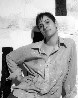
Self Portrait of Featured Artist Denee BlackThe Featured Artist chosen from the July and August entries is Deneé Black.  Black’s work forced me to stop and inspect each piece, to look for the storyline.  My life is always buzzing and busy. I truly appreciate the simple moments that inspire life, AND I appreciate the not so subtle reminder that it is up to me not to miss the BEAUTY of everyday life.

FEATURED ARTIST:
Deneé Black

Black was born and raised in North Carolina and is happy to still call it home. All her life she has loved to draw and create. When she was little she wanted to illustrate children’s books and at one point, medical books.

In high school, she was fortunate enough to have an amazing art teacher that encouraged her to develop her talents. That led Black to decide to earn a degree in graphic design.

“I then learned to think like a designer.
I love that I am a painter with a design degree
and not a painting degree.”

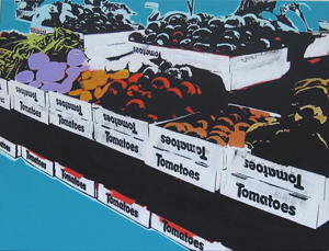
Vegetables in Tomato Boxes by Denee BlackThe influence of Black’s study of graphic design is evidently demonstrated in her work today.  She worked as a designer for a few years but quickly lost interest.  To cure her creative burnout, Black took a break from both design AND art.

“I sometimes wonder about all the years that I lost not creating artwork, but I know that the break was a necessary step in my personal process to being where I am now as an artist,” says Black.

But I wanted Black to explain–why the Farmer’s Market? Why Cityscapes?  Where’s the soul in that? “My work is about bringing attention to the everyday scenes in life that are often overlooked.  Though I take inspiration from where I live and places that I visit, the places and subjects that I choose to highlight are the ordinary spots that can be found in any city.

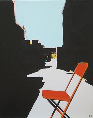
Orange Chair in Alley by Denee BlackBoth the Cityscapes series and the Farmers Market series are about the color, form and energy in these common scenes.  When I am captured by a striking city perspective or a pile of yellow peppers at the farmers market, I am surrounded by other people bustling about.  Often times those people are too busy to notice the beauty around them”

What do you consider your media? Do you once again consider yourself a graphic designer?  “Typically, I refer to myself as a mixed media artist or a painter. My design background doesn’t influence my ‘title’ but it definitely influences my work! I haven’t done graphic design for a number of years (so I haven’t referred to myself as a graphic designer in quite some time) but I still think like one.”

Talk to me about how you work, your process. Do you have special terminology that you have developed for how you work?  “I don’t use any special equipment. My favorite piece of equipment would be my camera, affectionately named ‘Olympia’ (yes, it’s an Olympic camera). Most all of my work is taken from inspiration that I documented with my camera.  I work mostly in acrylics utilizing my photography, image transfer and collage (including my own screen printed collage pieces).

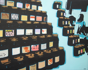
Jars of Blackstrap Molasses by Denee BlackMy favorite substrate with which to work is always stretched canvas but depending on my goal for a specific piece, I will use paper or wood for my process if I think it will add to the work.  Although I have my preferences but I think it’s good to be flexible in regards to processes and materials because that’s how you learn (and accidentally find out) new things. I usually exhibit my work on gallery wrapped stretched canvas. I like the casual elegance of that presentation–no outline or frame, just artwork.”

You know we have to talk about food: “Well, I am just going to be honest… Potato Chips! I don’t like a particular brand or flavor as it depends on my craving at the moment. Hands down, they have been my favorite food my entire life.

“When I was little, I had pajamas that said,
‘Potato chips are vegetables too!’
I still stand by that logic.”


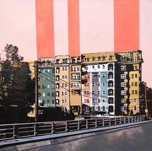
Boylan Buildings by Denee BlackSo, what’s coming up next for you, Deneé?  “This year has been pretty busy. I am a deadline oriented person.  I like deadlines because they help keep me focused.  The bad thing about them is that they don’t allow me much time for research and experimentation in my art.  I want to grow and improve as an artist so I am going to purposefully focus on that for a bit. ”

Thank you, Deneé Black for reminding us as we head into Fall to contemplate the beauty that surrounds us every day.  I am inspired to snuggle in for the comforts of autumn and not miss a thing.  See you on the tomato aisle!

Learn more about Deneé Black online!

Learn more about Featured Artist Denee Black!

Want to be a Featured Artist on www.ArtAndArtDeadlines.com?
Check out the
$2 Art Contest!

CALL for ENTRIES: Butterfinger

Click to Subscribe to www.ArtAndArtDeadlines.com by Email!

SCARY SWEET

I have such a sweet tooth that it is a wonder that I HAVE teeth!  I love chocolate… and most things you can cover in chocolate.  You can keep your chocolate-covered insects, thank-you-very-much.  Chocolate covered crickets and grasshoppers are less delicacy and more something out of a horror movie for me.  Butterfinger bars, on the other hand.  How was that for a segue?  Butterfinger AND horror movies, what more could you want from a Call for Art Entries?  Don’t miss this one…

Check out this Call for Entries for the Butterfinger the 13th Movie Poster Contest!  There doesn’t seem to be a entry fee, and it is tailor made for graphic designers and illustrators!  The assets are even available for download!  Take a look…

*Editor’s Note:  I love Butterfinger; however, this post is NOT sponsored by Butterfinger, it’s parent company or subsidiaries.  I wish it were, ha.

CALL for ENTRIES:
Butterfinger the 13th Poster Contest

Learn more about Butterfinger the 13th Poster Contest!Butterfinger is recruiting filmmakers, artists & musicians to contribute to the Butterfinger the 13th project alongside their director Rob Lowe! Submit scenes, posters & scores to help Rob finish his movie.  Here are the basics about the Poster Contest:

ELIGIBILITY:  The Contest is open only to legal residents of the 50 United States or the District of Columbia who are who are at least 18 years of age or older at the time of entry.

MEDIA:  There appears not be a media restriction.  However, poster entries must be in English, must be submitted as a JPG or PNG file not exceeding a file size of 10MB. If chosen as a Finalist, Entrant must be able to submit the Poster Entry in a format printable with clarity at 29×41 inches at 300 DPI and CMYK and delivered in an Illustrator or .PDF file.

Learn more about Butterfinger the 13th Poster Contest!DEADLINE:  September 1, 2011

NOTIFICATION: Finalists will be notified on or about September 8, 2011 by email and/or phone.

ENTRY FEE:  Appears to be none.  Editor’s Note:  As with all corporate-sponsored contests, there are pages and pages of rules and guidelines.  Do your homework and read them all!

JUROR:  Poster Entries will be judged based on the following criteria (“Poster Judging Criteria”):

(1) Originality (25%);

(2) Inspires Intrigue to watch Movie (25%);

(3) Helps tell the Movie’s story based on synopsis (25%); and

(4) Creativity (25%).

Learn more about Butterfinger the 13th Poster Contest!The Entrant whose Poster Entry has the highest total score among all judging criteria will be named a Finalist, subject to verification of eligibility and compliance with these Official Rules. In the event of a tie, the tied Poster Entries will be re-judged by the lead judge from the judging panel based on the same Poster Judging Criteria and the Entrant whose tied Entry receives the highest score amongst all Poster Judging Criteria will be deemed the Finalist.  There will be one (1) Finalist for the Poster category.

AWARDS:  One Poster Finalist (1) will receive a check for $2,000 made payable to the Finalist, or Finalist’s parent or legal guardian if Finalist is an eligible minor.  One Poster Runner Up (1) will receive a check for $1,000 made payable to the Runner Up, or Runner Up’s parent or legal guardian if Finalist is an eligible minor.

For complete details, Read the Full Call!

Learn more about Butterfinger the 13th Poster Contest!

FEATURED ARTIST: Terri Lloyd

Click to Subscribe to www.ArtAndArtDeadlines.com by Email!SPOONFUL of
SUGAR

When the $2 Art Contest began, I thought it would be easy to sit on my rear and judge other people’s work. Turns out, it isn’t quite so simple.  A glass of wine is always helpful when figuring out whose work to feature, and how to word all the rejection letters.  Chocolate or goat cheese are excellent substitutes for a fine wine, in my humble opinion.  But this month’s Featured Artist finds her comfort in gnocchi.

I have a soft spot for portraiture, as you all well know.  However, I also have an attraction to typography and work that doses out a sometimes less than palatable dose of vinegar with a spoonful of sugar. Ha.  Now you can sing THAT song for the rest of the day.  It is frequently the attempt of my own work, so I suppose I am just self-absorbed enough to be attracted to it in others’ work.

This month’s artist has
a voice that will not be silenced:

and I suspect she doesn’t care what we think, either way.
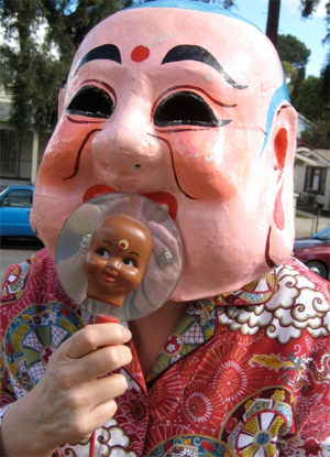
 

Terri Lloyd as the Pink Buddha!The Featured Artist chosen from the May and June entries is Terri Lloyd. Lloyd’s work, quite simply, makes me clutch my guts laughing, then, once I’ve caught my breath, I say, “Hmmmm.”  I enjoy the guiltless laughter at vibrant work with both a message and a sense of humor.  I am inspired to remember that we are not invisible, you and I, and WE decide how to use our gifts.

FEATURED ARTIST:
Terri Lloyd


Terri Lloyd is a San Francisco Bay Area transplant that has called Los Angeles home since 1980.  Under the influence of a Sixties latch-key-kid youth, the circumstances of a working class life did not provide the conventional means to an art education or experience.

“It has been challenging, but I refuse to let the institutions get in the way of my education.  Knowledge is now available at our fingertips.  There is no excuse for ignorance.  Ignorance has become a choice.”

Introduced to the Apple Macintosh in 1987 a love affair with digital art was born.  Terri has never viewed computer generated imagery as a movement.  The computer and software are tools.  How the operator chooses to use them remains as individual as any other artist working in any other medium. 

Vessels by Terri Lloyd“I compare the work I create
to advertising.”


It’s about formulating the right message first, and not becoming a sporting event half-time fiasco that baffles the viewer with high tech circus tricks.”

Terri’s approach is something that she terms a “whole-istic Zen,” which emulsifies decades of commercial and graphic arts expertise into pointed, often controversial visuals.  Seasoning her images with pun and insinuation, all the while thumbing her nose at conventional wisdom and other popular absurdities.

She currently resides in Northeast Los Angeles with her husband, three cats and one boisterous macaw.

But I wanted Lloyd to weigh in on the “Pink Buddha” image to which she has become inextricably linked:  “Pink Buddha is a mythological creature who appears from time to time planting whimsy and baby headed flowers, reminding us to lighten up and stop taking ourselves (especially artists) so very seriously.
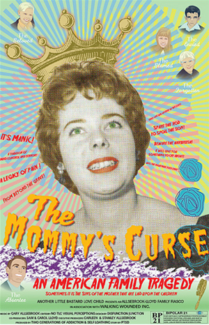
The Mommy's Curse by Terri LloydI suppose the significance to me is that I want a happier mythology, or creation story.  I don’t like what religion, dogma, ideology does to people.  Sure, there’s some good, but then again look at what is happening around the world.  We need a better, nicer story about who we are and why we are here on this small blue marble hurling through space.”

What do you consider your media? Are you a graphic designer? Or may I suggest Art Terrorist?  “I guess I’m a story teller mostly. A sort of chimera, part graphic designer, part digital artist, part performance artist, another part absurdist (okay, smart ass).   I like ‘Art Terrorist.’   I might change it to “Art Terri-ist.” (My ego again, sorry.)  I think I’m a surrealist or absurdist with photographic and digital execution.”

Talk to me about how you work, your process. Do you have special terminology that you have developed for how you work?  “The Pink Buddha video was shot using a cheap digital camera.  I’ve also created prints with linoleum, and silk screen.  Oh and I’ve even made prints using the now defunct Print Gocco.”

“The terminology I use for how I work is ‘riding the crazy train’.”
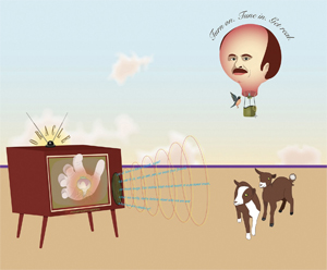
 

Dr. Phil Save Us From Ourselves by Terri LloydYou know we have to talk about food: “Well, I believe the tree of life is made from pasta.  I love Italian food. Gnocchi brings me great comfort.  So does lasagna.  But I also love Indian food. I’m a nut for saag paneer and dal.  I love fish, and the cockroach of the sea, shrimp.”

So, what’s coming up next for you, Terri?  “Lots of fun.  I’ll have a piece in the Brand 40 Works on Paper exhibition at the Brand Library and Art Galleries in September.  In October, if all goes well, my organization, The Haggus Society, will be hosting it’s first exhibition in Pasadena. We’re still sorting out some of the details.

B*tch Fest is something The Haggus Society is working toward building. Ideally it will be a month long exhibition or festival celebrating the older female artist.  For some reason, older women in the arts have no voice, and very little institutional support.  Particularly for the re-emerging artist.  It’s as if we are invisible.  Our objective is to change the thinking about this.”

Thank you, Terri Lloyd for the unapologetic middle finger you give to conformity.  I am inspired to scream at the top of my lungs…with my own art.  You are a lune of the best kind. 

Learn more about Terri Lloyd online!

Click to learn more about Artist Terri Lloyd!

Want to be a Featured Artist on www.ArtAndArtDeadlines.com?
Check out the
$2 Art Contest!

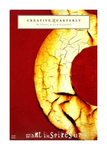
CALL for ENTRIES: Creative Quarterly No. 25

Click to Subscribe to www.ArtAndArtDeadlines.com by Email! FOOD YES,
WHINE NO

I am a magazine reader. Yep, the paper ones. I read and peruse imagery as motivation for household projects, photography and, of course, cooking. And the occasional gossip rag.  One of my favorite food magazines? Food and Wine, of course. I have delusions of grandeur each and every time I watch Top Chefs that I could win that show and have my work featured in F&W. Instead, I am opting to submit my art to this Call for Creative Quarterly. Do you think Food & Wine will be so impressed they will cover my food anyway? Me neither. Anyway, don’t miss this opportunity…
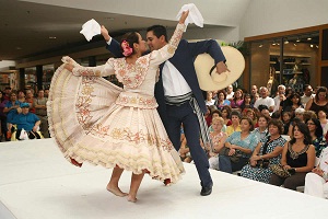
Check out this Call for Entries for Creative Quarterly. The entry fee is an incredibly low $10, and art publication is great exposure for your work. Great news…it isn’t limited just to photography!  Take a look!

Click to download the Prospectus for Creative Quarterly No 25!CALL for ENTRIES:
Creative Quarterly 25

Creative Quarterly asks the question: Where does your inspiration come from?

What person, place or thing inspires your work?

By launching a new redesign, they’ve become a much more interactive journal. They search the web for interesting projects in art and design to share with their readers. They ask their readers to share what inspires them. The purpose, not to copy but to inspire.

Take a look at back issues of Creative Quarterly!Inspiration can come from an innovative chair design or an unusual ring or from an interview with a well-known designer or artist or something from ones past.

Creative Quarterly is the best of art and design, quarterly.


ELIGIBILITY & MEDIA: Open to all undergraduate and graduate students, recent graduates, professors, instructors, graphic designers, art directors, illustrators, photographers and fine artists in all media.

All entries must have been completed during the last twelve months. All art directors, graphic designers, photographers, illustrators and fine artists are eligible to enter —professionals and students are judged separately. Judging is done digitally. Submission of entries acknowledges the right of to use them for publication, exhibition and promotion.

Learn more about Creative Quarterly online!CATEGORIES:
Fine Art, Graphic Design, Illustration and Photography

ENTRY FEE: $10 per entry. Entering a series? Each piece is still $10.

DEADLINE:
July 29, 2011

NOTIFICATION: Will be listed on website & by email in 6 to 8 weeks.

SUBMISSIONS: Each entry must be submitted as:

  • 300 dpi, RGB, Jpeg
  • Vertical images must be 8″ wide.
  • Horizontal images must be 10″ wide.

For complete details, Download the Prospectus!

CALL for ENTRIES: Hispanic Heritage Celebration

Click to Subscribe to www.ArtAndArtDeadlines.com by Email!CHEESE PLEASE!

Warm cheese makes the world go ’round.  When I’ve had a hard day, there is nothing I love more than nachos and a raspberry pineapple daiquiri and my local creekside cantina.  But sometimes we must remind ourselves that there is far more depth of flavor and choice in Hispanic food than your favorite local Mexican haunt.  South America, Central American and much of the Carribean offer food your taste buds will never forget.  This Call for Entries is a reason to celebrate the flavor! 

Check out this great Call for Entries for the Hispanic Heritage Celebration’s Poster Contest at the Miami International Mall.  This is a great FREE opportunity for all of you graphic designers and illustrators looking for a great credit on your resume.  Don’t miss this chance…

CALL for ENTRIES:
Hispanic Heritage Celebration Poster Contest


Click to download the poster contest prospectus for the Hispanic Heritage Celebration!Miami International Mall will showcase the colorful flavors of Latin American countries during its 7th Annual Hispanic Heritage Celebration from September 30 through October 2.  This free-to-the-public weekend event will feature folkloric music and dance, country exhibits, art and flag displays, live entertainment and a parade of native dresses from South America, Central America and the Caribbean countries.

In observance of National Hispanic Heritage Month, Miami International Mall is sponsoring its first poster contest, which is open to the general public. 

The poster should reflect the artist’s interpretation or rendition of what Hispanic heritage and culture means to them. The poster should also incorporate the use of the Hispanic Heritage Celebration logo.

Winning artwork will be made into the official poster for the 7th Annual Hispanic Heritage Celebration and may also be used for promotional event items such as programs and invitations.

The winning poster will be unveiled at the 7th Annual Hispanic Heritage Celebration kick-off reception, which will be held on Wednesday, July 27.

ELGIBILITY:  The poster contest is open to all artists.

MEDIA:  Size of the poster must be 11’’ x 17’’. Poster must be mounted on a 15’’ x 21’’ board.  High resolution of the poster entry art must also be submitted in its native format that it was designed in.  Digital art should be burned onto a CD and attached to the mounted poster.  Official Hispanic Heritage Celebration logo must be used without any alterations of color or typography.  Entry form must be attached to the back of the mounting board in the upper right hand corner.

Download the Prospectus for the poster contest for the Hispanic Heritage Celebration at the Miami International Mall!DEADLINE:  Friday, July 1, 2011

ENTRY FEE:  There is no entry fee.

JUROR:  The winning artwork will be selected by the Hispanic Heritage planning committee. Submissions will be evaluated on the following criteria: portrayal of Celebration theme and message, use of logo, originality, visual effectiveness and quality of design.

AWARDS:  A $500 Simon gift card will be awarded to the winning artist.  The winner will also receive an invitation to the kick-off reception.

For complete details, Download the Prospectus!